
From our friends over at FRED, for the holiday season or any other time, get yourself a Gin&Titonic ice cube tray. Fun!
From our friends over at FRED, for the holiday season or any other time, get yourself a Gin&Titonic ice cube tray. Fun!
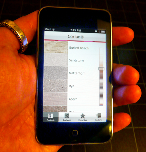
Dupont sent designverb an iPod Touch to test out their new MySurface app which has a catalog of Corian and Zodiaq materials. It’s a pretty simple app with a library of images to flip through and a gallery of environments. Though I personally find materials like Corian and Zodiaq very tangible, a quick glance at colors and texture visually with this app can be quick filter in selections before grabbing real samples to feel their weight, temperature, light refraction, and vibe.
And yup, I’m giving away a brand new iPod Touch (thanks dupont) to a reader that sends me the best improvement for this app or any other general cool design must have app that does not exist. Send ideas to designverb (at) gmail.com . I’ll pick a winner in a few weeks.
I’ve got a few suggestions for this particular app:
1. For iPhone users, let them use the camera, and augment the materials in their real space.
2. Let the materials be custom adjustable to augment onto their cameras view like a table.
3. A details page about the material like hardness, texture, cost, colors, uses, weather, etc.
4. Options in sorting, not just by color, but by hardness, texture, weight, grain, cost, etc.
5. Have a gallery of images for each material, not just a separate gallery.
6. I know Corian has some translucency . Maybe show what the material looks like when thin and back lighted.
7. Add an adjustable bar to have light go across the material. See how it reflects, moves, changes.
8. Maybe add some filter options… dark, marble like, textured…search.
A few pics of the app after the jump of the app.
(more…)
“The Obama presidential campaign was innovative. For the first time in American politics, a candidate used art and design to bring together the American people—capturing their voices in a visual way.
The Design Director of the Obama campaign, Scott Thomas, has collaborated with artists and designers to create Designing Obama, a chronicle of the art from the historic campaign. Get the inside story on how design was used by the campaign, and scope out the pieces, created unofficially, by grassroots supporters.”
This book will only happen enough donations are received by November 4th. They are 2/3rds they way there, so if you you’d like to buy the book ($50) or donate a smaller amount for a pdf of it ($10) visit their site now.
designing-obama.com
(thanks paul)
Transform an existing staircase in a subway staircase next to an escalator into a step-a-thon playing piano, and people will walk. Add fun changes common behavior!
Reminds me of Bruno Taylors Playful Spaces Bus Stop Swing Set.
If your liking these video posts, go join the Designverb Facebook Fan page, where I’m posting lots of cool videos not on designverb, including my tweets, Last.fm favorites, yelps, and much more.
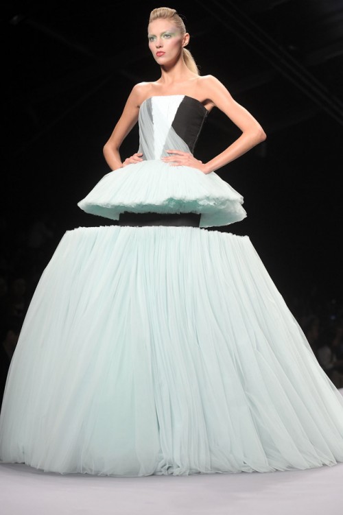
I found the Viktor & Rolf Spring 2010 collection rather disruptive. Cool!
via todayandtomorrow

Philippe Starck has a reality show about design called Design For Life on the BBC… but not just design, but more importantly design thinking, observation, understanding, and how design is almost more about everything outside of what most think of design.
If your in the UK, let me know how the show is. If your not in the UK, you can catch a glance of the first hour long episode on Vimeo here or above.
Thus far, I’ve enjoyed the first episode and think it’ll be a great insight into what design really is… not just aesthetics or making cool objects, but understanding a story as a whole, a process, an eco-system and a rather complex element that is widely ignored.
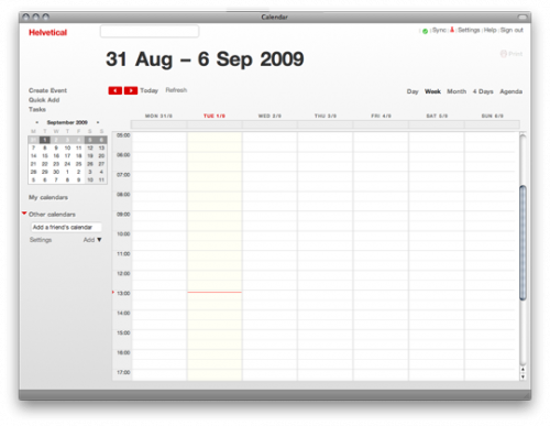
If you’ve got some Helvetica love and use twitter, Google Calendar, or Google reader, your in luck… give your web tech a clean graphic makeover using Helvetical (Google Calendar), Heletwitter ( twitter), and Helvetireader (Google reader).
I use the Helvetical(above image), tweaked it a bit and love it!
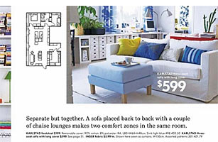
IKEA’s 2009 online catalogue uses the old typeface. (Futura)
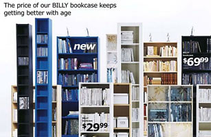
IKEA’s 2010 online catalogue features the Verdana font.
Unbelievable! IKEA switches up their long lasting Futura font that everyone has grown to love to Verdana which though great, just quite doesn’t do the trick for me for an icon like IKEA! Outrage I say =)
Much like the whole Tropicana rebranding disaster that got rejected by consumers once it came out, I’m not sure this is a good move, though change and understanding take time… I’m sure ther was a reason for this… wait, isn’t Verdana a free font from Microsoft? I’ve had recent troubles in license agreements with font foundries.
Article:
“Thumbing through his local Swedish newspaper, Göteborg resident Mattias Akerberg found himself troubled by a full-page advertisement for Ikea. It wasn’t that the Grevbäck bookcases looked any less sturdy, or that the Bibbi Snur duvet covers were any less colorful, or even that the names given to each of the company’s 9,500 products were any less whimsical. No, what bothered Akerberg was the typeface. “I thought that something had gone terribly wrong, but when I Twittered about it, people at their ad agency told me that this was actually the new Ikea font,” he recalls. “I could hardly believe it was true.”
full article after jump via Time.
Chow.com has a great video interview with John Nese of Galcos incredible soda pop store of more than 500 sodas. Very insightful video briefly talking about history in flavors, bottles, ingredients, politics, experiments, and just plain great to watch!
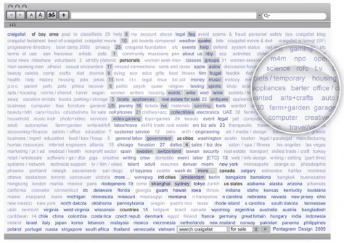
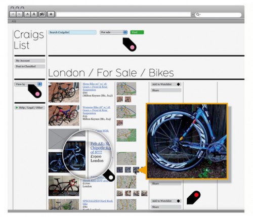
Above images:
Pentagrams Luke Hayman with Lisa Strausfeld and Matt Willey of Studio8 Design.
“The craigslist team isn’t interested in updating the site, so Wired asked leading designers to give it a user-interface lift.”
I love Craigslist but I’ve always wondered about their interface. Do I like it, hate it, or is it just right? As a designer I’ve always craved images, but also as a designer I love the directness in raw text. They’ve made subtle changes over the years but if they launched with a more visual design would they have been more successful, worse, or the same? What role does design actually play a part of in our society for sucess, what do people latch onto, what makes it work, and is great design about differentiating from the rest of the world?
Anyhow, I’m not sure what I’d do to improve Craiglsit since it’s just that good, besides all the spam which often becomes part of the culture.
More at Wired